Pattern Play: Mix Prints with Confidence
Master the art of mixing stripes, florals, checks, and animal prints with proportion, palette, and scale, plus foolproof formulas to build bold cohesive looks
Print Pairing Basics
Mixing prints feels daring until you apply a simple framework. Begin with an anchor: a piece whose colors and mood set the tone, like a stripe tee or a classic check blazer. Then introduce a second pattern that shares one color or a similar vibe, and add a grounding piece in a solid to give the eye a place to rest. If you want a third print, keep it tiny and contained in an accessory such as a scarf or belt. Prioritize repetition and balance: echo a stripe's color in a floral bud, or repeat a dot's curved shapes in rounded jewelry. Lean on familiar staples, because stripes, polka dots, checks, and animal prints behave like style neutrals and mix easily. Keep your silhouette clean and your hemlines uncomplicated so the patterns do the talking. When in doubt, pair lively prints with quiet tailoring, and let one piece lead while the other supports. That simple hierarchy builds instant confidence.
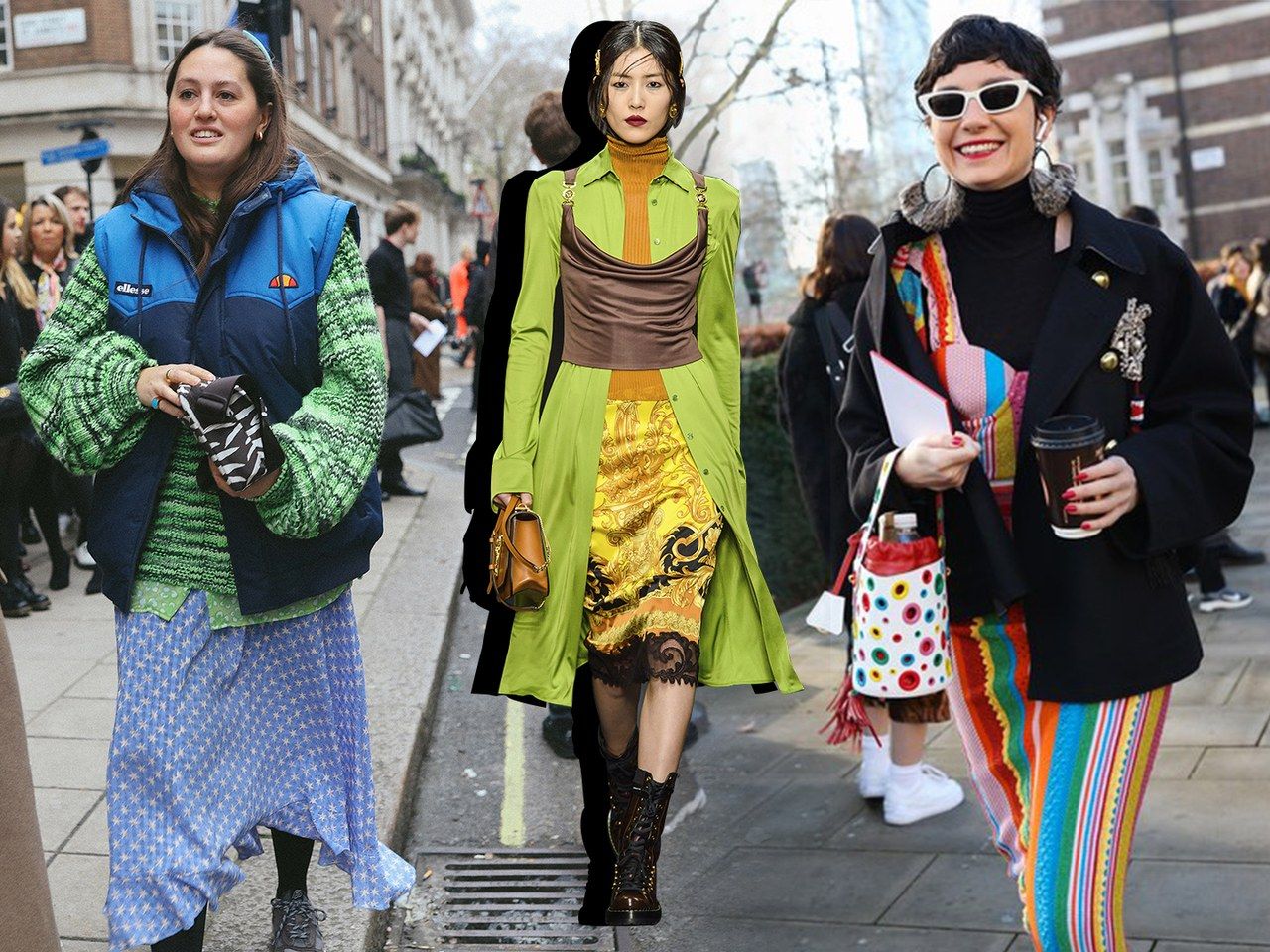
Scale, Space, and Harmony
Great print mixing hinges on scale. Combine a micro pattern with a macro one to create contrast without chaos. A tiny ditsy floral looks refined next to an oversized windowpane; a wide rugby stripe sings with small polka dots. Notice negative space and density: airy prints with open backgrounds read calmer than tight, allover motifs. Use them to pace your outfit so it breathes. Consider line weight too. Bold, thick stripes carry more visual weight than fine pinstripes; pair them with lighter patterns to keep the proportion even. Strategic placement matters: a statement skirt can take a quieter top, while a vivid blouse benefits from sleek trousers. Add a slim belt or a neutral shoe to interrupt busy pairings and restore rhythm. Structured pieces frame exuberant prints, while fluid fabrics soften graphic edges. By mixing scale, spacing, and silhouette intentionally, you craft a harmonious story where each print has room to shine.
Color as the Unifying Thread
Color is your stealth stylist when mixing patterns. Start with a color story of two or three hues and let every print connect back to that palette. A shared shade creates a bridge between stripes and florals, even if their motifs differ wildly. Manage value contrast by deciding whether you want high drama or quiet elegance; stark light-and-dark pairings feel crisp, while tonal mixes read sophisticated. Balance saturation and temperature too. Warm, earthy tones blend effortlessly with animal prints and checks, while cool shades flatter geometrics. A neutral base, like denim, camel, navy, or black-and-white patterns, acts as glue for bolder pieces. Try a monochrome approach by layering different prints within one color family; the result appears polished and intentional. Use a single accent color to spark continuity across shoes, bags, or trims. When your hues align, even unexpected patterns cooperate, and the outfit looks cohesive from every angle.
Texture, Fabric, and Print Personality
Prints do not exist in a vacuum; texture and fabric affect how they read. A ribbed knit stripe feels sporty, while a silk floral whispers romance. Combine a nubby tweed houndstooth blazer with a satin dot blouse to contrast matte and sheen, or pair linen gingham with crisp poplin stripes for fresh lightness. Consider drape and weight: fluid fabrics soften bold graphics, and structured textiles give small patterns presence. Pay attention to sheen levels; glossy snake embossing acts like a print even without contrasting colors. Recognize personality cues: geometrics skew modern, florals feel feminine, plaid leans classic, and animal reads bold. Blending personalities creates depth, but keep at least one element consistent, like color or scale, to anchor the mix. Finishing details matter: topstitching, pleats, and piping can echo lines within patterns, reinforcing your theme. Thoughtful fabric choices ensure your prints complement rather than compete, elevating the entire look.
Practical Formulas and Outfit Ideas
Lean on reliable formulas to build outfits fast. Stripes with florals is a timeless match; pick a stripe that shares one flower shade and keep the rest of the look neutral. Checks with dots create graphic charm; vary scale by pairing a bold check skirt with tiny dots up top. Animal print behaves like a neutral; ground it with a color-block knit that repeats one of its tones. Geometric with organic is a power duo; a sharp chevron balances a soft botanical. For the office, try a pinstripe trouser, micro-dot blouse, and solid blazer. For weekends, mix a gingham shirt with a floral slip skirt and minimalist sneakers. Elevate evenings with a metallic-thread plaid and a silk paisley scarf. Use a 70/30 ratio of dominant to supporting print, and add a quiet bag or shoe to rest the eye. These repeatable recipes keep experimentation controlled and stylish.
Confidence, Care, and Sustainable Strategy
Confidence grows with practice. Do a mirror test from multiple angles, and take quick photos to evaluate balance, color, and proportion. Edit ruthlessly; remove one item if the look feels crowded, or add a solid layer to create breathing room. Build a capsule of dependable patterns: a stripe tee, polka dot blouse, leopard flats, a check blazer, a floral skirt, and a graphic scarf. Rotate them with seasonal textures to stay fresh without constant buying. Prioritize fit and tailoring so prints align cleanly at seams and hemlines. Preserve vibrancy with mindful care: wash inside out when appropriate, use gentle detergents, and press rather than over-steam to protect crisp lines. Store knits folded to prevent stretching of motifs. Swap or borrow statement pieces to reduce waste and expand your options. Most importantly, own your choices; posture, pace, and presence complete the look. With intention and upkeep, your pattern mixes remain polished and personal.