Color Pairing Made Easy: From Neutrals to Bold Combos
Master color pairing from effortless neutrals to daring bold combos. Learn simple formulas, palette tips, and outfit ideas to refresh your wardrobe.
Neutral Foundations: Neutrals are the quiet powerhouses of a wardrobe, grounding outfits and making color pairing feel effortless. Think black, white, gray, navy, beige, and taupe as your dependable base notes, each offering different levels of value (lightness or darkness) and temperature (warm or cool). Start by building looks around one dominant neutral and layering textures—matte cotton, soft cashmere, crisp poplin, sleek satin—to add depth without visual noise. A monochrome palette in varied fabrics feels intentional, while subtle shifts in tone create dimension without clashing. Keep an eye on undertones: a cool gray complements icy blues and charcoals, while a warm camel harmonizes with earthy olives and rusts. Accessories in gold or silver can echo those temperatures and pull everything together. When in doubt, lean on a capsule approach: two to three neutrals that mix seamlessly, letting you insert bolder shades as accents. This foundation ensures versatility, polish, and a calm canvas for creativity.
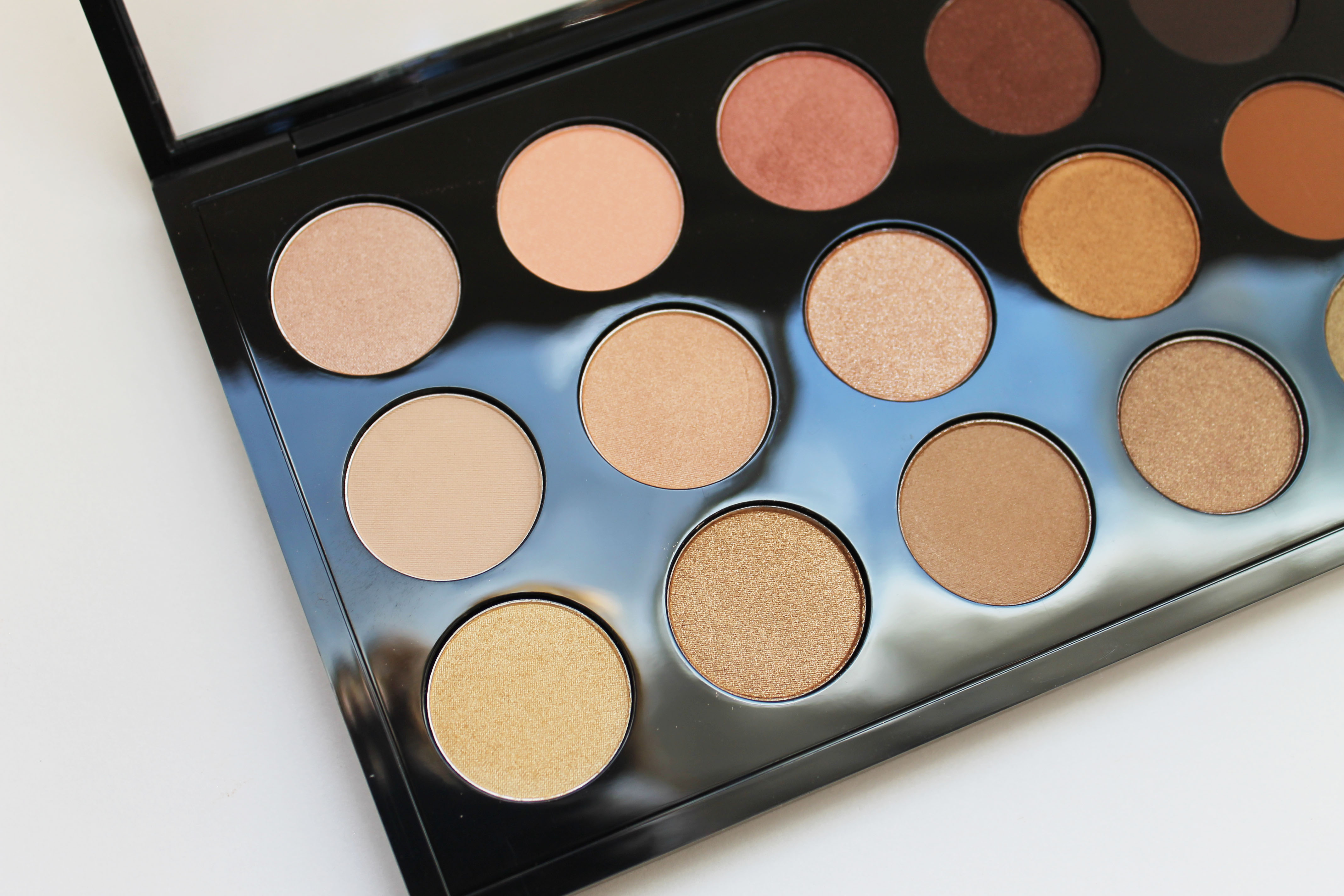
Undertones and Temperature: Successful color pairing starts with understanding undertones—the subtle warmth or coolness beneath a hue. Warm colors carry golden or red bases (think coral, mustard, terracotta), while cool colors skew blue or green (like teal, fuchsia, or icy lilac). Neutrals have undertones too: cream is warm, optical white is cool, and stone gray can be balanced or lean either way. Aligning undertones keeps outfits cohesive; mixing them deliberately can work if you anchor with value contrast or a unifying texture. Consider saturation and chroma as well: pairing a muted sage with a dusted rose feels refined, while a vivid emerald beside bright magenta leans bold and energetic. If your skin, hair, or eyes read warm or cool, let that inform metal choices—gold amplifies warmth, silver sharpens coolness. Test combinations in natural light, noting how fabrics shift. The goal is harmony, not rules, using temperature as a compass rather than a cage.
Contrast, Proportion, and Balance: Color is only half the story; contrast and proportion decide whether a combination sings or shouts. Use the 60-30-10 guideline as a flexible tool: 60% base color, 30% supporting shade, 10% accent. Value contrast (light vs. dark) adds structure, while contrast in saturation (muted vs. vivid) shapes mood. Pair a deep navy suit (60) with soft dove gray (30) and a pop of saffron (10) for a refined, modern finish. In casual looks, let denim act as a soft neutral that bridges hues. Keep scale in mind: large color blocks feel graphic; small color notes—belts, bags, collars—add nuance. Prints and patterns can carry multiple colors if one tone matches your base and another echoes your accent. Balance is key: if your shoes or bag are bold, soften elsewhere with calm textures or subdued tones. This interplay of proportion and contrast keeps outfits cohesive, intentional, and visually engaging.
From Soft to Statement: Color Bridges: Moving from subtle to striking is easier with color bridges—hues that sit between neutrals and brights. Think olive, dusty rose, oatmeal, camel, moss, smoky blue, and blush. These transitional shades connect high-impact colors to everyday basics, smoothing the jump between palette extremes. For example, pair camel trousers with a smoky blue shirt, then introduce a chartreuse scarf as your accent; the muted blue softens the neon, while camel anchors the look. Analogous combinations—colors neighboring on the wheel—feel harmonious: moss, olive, and lime, or coral, blush, and red. Try tonal layering by stacking deeper and lighter versions of the same hue, adding a crisp neutral to prevent muddiness. Denim is a universal bridge, especially mid-wash, which blends easily with nearly any palette. When adding color-forward outerwear, let mid-tones against your base guide the transition, ensuring the statement piece looks integrated rather than isolated.
Bold Combos with Confidence: When you're ready to turn heads, lean into complementary and triadic schemes. Complementary pairs—like cobalt with terra-cotta, emerald with coral, or violet with chartreuse—create high-energy contrast. Tone them down by choosing slightly muted versions or balancing with a grounding neutral such as charcoal, ecru, or espresso. Triadic trios—three equidistant colors—offer playful balance; try teal, marigold, and raspberry, keeping one dominant while the others appear in smaller doses. Explore color blocking with clean lines for a modern look, or soften bolds through texture: matte knits tame saturation, while silk and satin intensify sheen. In patterns, echo a bright from the print with your shoe or bag to reinforce cohesion. Don't forget fit and silhouette; a streamlined shape makes loud colors feel sharper and more wearable. Confidence comes from intention—choose your hero hue, then curate supporting players that highlight, not compete.
Practical Playbook and Styling Tips: Streamline your process with a repeatable palette method. Step one: choose an anchor neutral that flatters your undertone. Step two: add your main hue—the color that sets the mood. Step three: select a small accent to spark interest. Step four: harmonize textures and metals to finish the story. Build a mini capsule around two anchors and two to three colors, mixing prints that reflect those shades. Test outfits in daylight, then edit: remove one element if the look feels busy. Scale color to occasion—low contrast for formal, higher contrast for casual or creative settings. Rotate the accent from scarf to shoe to bag to refresh repeats. Maintain fabrics well; vibrant colors look best on garments with crisp structure and minimal pilling. Keep a personal swatch or photo album of favorite combinations for quick reference. Over time, your eye will calibrate, making color pairing second nature while preserving your signature style.